CSS 中的 BFC 和 IFC
- Published on
Demo 文件(github) Demo 实时预览(codePen)
Table of Contents
什么是 BFC?什么作用?
Block Formatting Context
块盒子布局发生的区域,浮动元素和其他元素交互的区域
浮动定位和清除浮动的时候只会应用于同一个 BFC 内的元素。浮动不会影响其他 BFC 中元素的布局,而清除浮动只能清除同一 BFC 中在它前面的元素的浮动。
外边距的折叠也只会发生在同一 BFC 中的块级元素之间。可以创建新的 BFC 来消除外边距的折叠问题。
常见的定位布局方案有,普通流,浮动和绝对定位。
BFC 是一块渲染区域,有一套渲染定位规则。决定子元素定位其他元素的关系和相互作用,是属于普通流的。具有 BFC 特性的元素可以看作是隔离了的独立容器,容器里面的元素不会在布局上影响到外面的元素,并且 BFC 具有普通容器所没有的一些特性。
其实也不是什么新鲜东西,可能都在用但不知道这个概念。
案例 1:使浮动元素和周围内容等高
对于以下代码:
<style>
  .box {
    background-color: rgb(224, 206, 247);
    border: 5px solid rebeccapurple;
    /* overflow: auto; */
    /* display: flow-root; */
  }
  .float {
    float: left;
    width: 400px;
    height: 150px;
    background-color: white;
    border: 1px solid black;
    padding: 10px;
  }
</style>
<div>
  <div class="box">
    <div class="float">I am a floated box!</div>
    <p>I am content inside the container.</p>
  </div>
</div>
显示的效果如下:
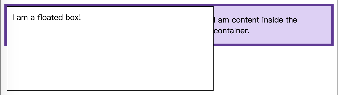
因为浮动盒子脱离了文档流。浮动的 div 元素更大,就穿出了边框。
一般是需要将盒子和浮动元素做成等高的,即浮动元素应该包含在 box 内部,要达到这个效果,可以这样:
1. 使用display: flow-root
一个新的display属性值,可以创建无副作用的 BFC。在父级元素中使用display: flow-root就可以创建新的 BFC。
可以理解为和创建根元素一样,创建一个文档流的上下文。
2. 使用 overflow:auto
只要设置 overflow 为一个非 visible 的值就可以。使用overflow创建一个新的 BFC,overflow会告诉浏览器如何处理超出部分的内容。
但是如果只是用来创建 BFC 的话,可能引发其他情况。
案例 2: 清除外部浮动
对于以下代码:
<style>
  section {
    height: 150px;
  }
  .box {
    background-color: rgb(224, 206, 247);
    border: 5px solid rebeccapurple;
  }
  .box[style] {
    background-color: aliceblue;
    border: 5px solid steelblue;
  }
  .float {
    float: left;
    overflow: hidden; /* required by resize:both */
    resize: both;
    margin-right: 25px;
    width: 200px;
    height: 100px;
    background-color: rgba(255, 255, 255, 0.75);
    border: 1px solid black;
    padding: 10px;
  }
</style>

<section>
  <div class="float">Try to resize this outer float</div>
  <div class="box"><p>Normal</p></div>
</section>
<section>
  <div class="float">Try to resize this outer float</div>
  <div class="box" style="display:flow-root">
    <p>
      <code>display:flow-root</code>
    </p>
    <p></p>
  </div>
</section>
这里需要关注的是float元素上的margin-right这个属性。
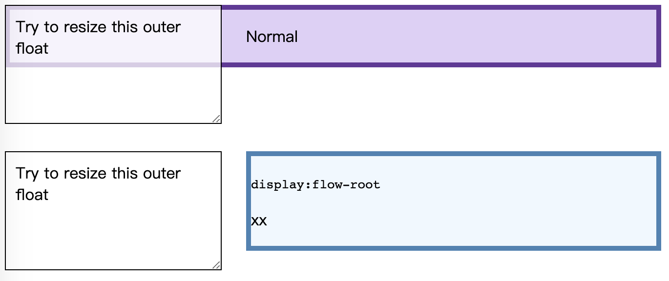
上面的两个元素之间,margin-right 没有生效。但是对box添加display:flow-root属性之后,margin-right 属性就生效了,左边的元素缩放的时候始终都保持有25px的距离。也就是 display:flow-root对同级的外部元素的浮动也清除了。
如果对 HTML 部分写成这样:
<section>
  <div class="float">Try to resize this outer float</div>
  <div class="float">Try to resize this outer float</div>
  <div class="box"><p>Normal</p></div>
</section>
<section>
  <div class="float">Try to resize this outer float</div>
  <div class="float">Try to resize this outer float</div>
  <div class="box" style="display: flow-root">
    <p><code>display:flow-root</code></p>
    <p>xx</p>
  </div>
</section>
消除同级元素的 float, 显示出 margin-right 的效果就更明显了。
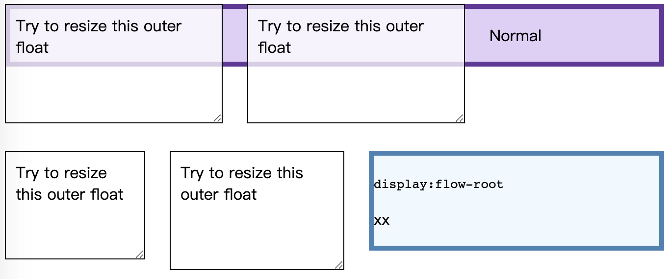
需要注意的是:清除同一 BFC 中的浮动,只能清除在它前面元素的浮动。
案例 3: 外边距塌陷问题
对于如下代码:
<style>
  .blue,
  .red-inner {
    height: 50px;
    margin: 50px 0;
    background: blue;
  }

  .red-outer {
    /* display: flow-root; */
    /* overflow: hidden; */
    background: red;
  }
</style>

<body>
  <div class="blue"></div>
  <div class="red-outer">
    <div class="red-inner">red inner</div>
  </div>
</body>
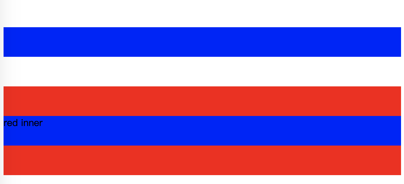
显示的效果如下:
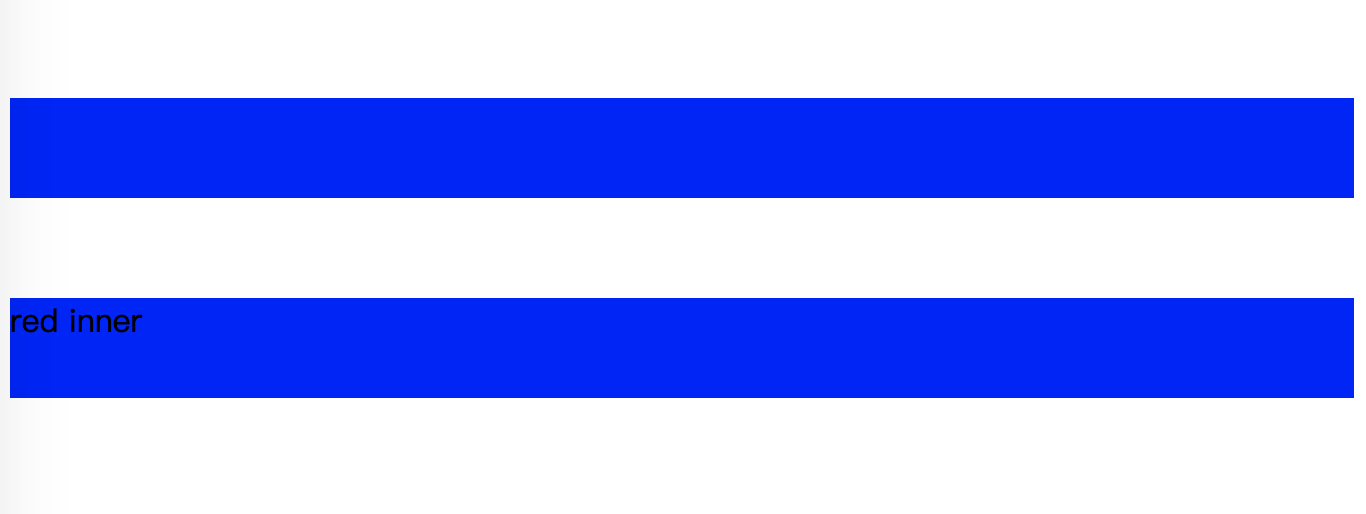
可以看到,对 red-inner 的 margin 没法撑起盒子,两个蓝色盒子之间的距离是 50px.
使用display: flow-root;
两个蓝色盒子就距离 100px 了,而且margin也完全显示了出来。
创建 BFC 的方法
使用这些 BFC 的特性,需要创建出 BFC:
- 根元素(
<html>) - 浮动元素(元素的
float不是none) - 绝对定位元素(元素的
position为absolute或fixed) - 行内块元素(元素的
display为inline-block) - 表格单元格(元素的
display为table-cell,HTML 表格单元格默认为该值) - 表格标题(元素的
display为table-caption,HTML 表格标题默认为该值) - 匿名表格单元格元素(元素的
display为table、``table-row、table-row-group、``table-header-group、``table-footer-group(分别是 HTML table、row、tbody、thead、tfoot 的默认属性)或inline-table) overflow计算值(Computed)不为visible的块元素display值为flow-root的元素contain值为layout、content或 paint 的元素- 弹性元素(
display为flex或inline-flex元素的直接子元素) - 网格元素(
display为grid或inline-grid元素的直接子元素) - 多列容器(元素的
column-count或column-width(en-US) 不为auto,包括 ``column-count为1) column-span为all的元素始终会创建一个新的 BFC,即使该元素没有包裹在一个多列容器中(标准变更,Chrome bug)
什么又是 IFC?
相对于块级格式化上下文,还有行内格式化上下文,Inline formatting context。
对于 IFC,行内框一个接一个地排列,排列顺序和书写方向一致。
- 水平书写模式,行内框从左边开始水平排列
- 垂直书写模式,行内框从顶部开始水平排列
一个行内框在被分割到多行中的时候,margin,border 以及 padding 的设定不会在断裂处生效 (边框跨行连续,不会产生两块 border)
Margin,border 和 padding 的设置在行方向上生效。
垂直方向上对齐
垂直方向上的位置主要是用vertical-align
<style>
  .horizontal {
    writing-mode: horizontal-tb;
  }

  .vertical {
    writing-mode: vertical-rl;
  }
  span {
    font-size: 200%;
    /* vertical-align: top; */
    vertical-align: bottom;
  }
</style>

<div class="example horizontal">
  Before that night—
  <span>a memorable night</span>
  , as it was to prove—hundreds of millions of people had watched the rising smoke-wreaths of their
  fires without drawing any special inspiration from the fact.
</div>
拉小浏览器窗口,显示效果:

而如果将vertical-align: bottom设置为top,效果则是顶部对齐:

需要注意的是,如果文字方向是垂直书写模式的话,对齐方式不变,但实际上应该是左右对齐,与 vertical-align 的字面意思稍有出入。在
vertical-align:top再加上writing-mode: vertical-rl。

水平方向上对齐
行内元素在水平方向上的位置主要是用text-align
<style>
  .horizontal {
    writing-mode: horizontal-tb;
  }

  .vertical {
    writing-mode: vertical-rl;
  }
  .example {
    text-align: center;
  }
</style>

<div class="example horizontal" style="border: 1px solid">One Two Three</div>
<div class="example vertical">One Two Three</div>
显示效果:

参考: